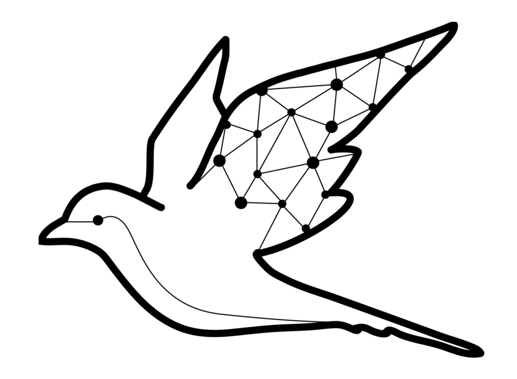
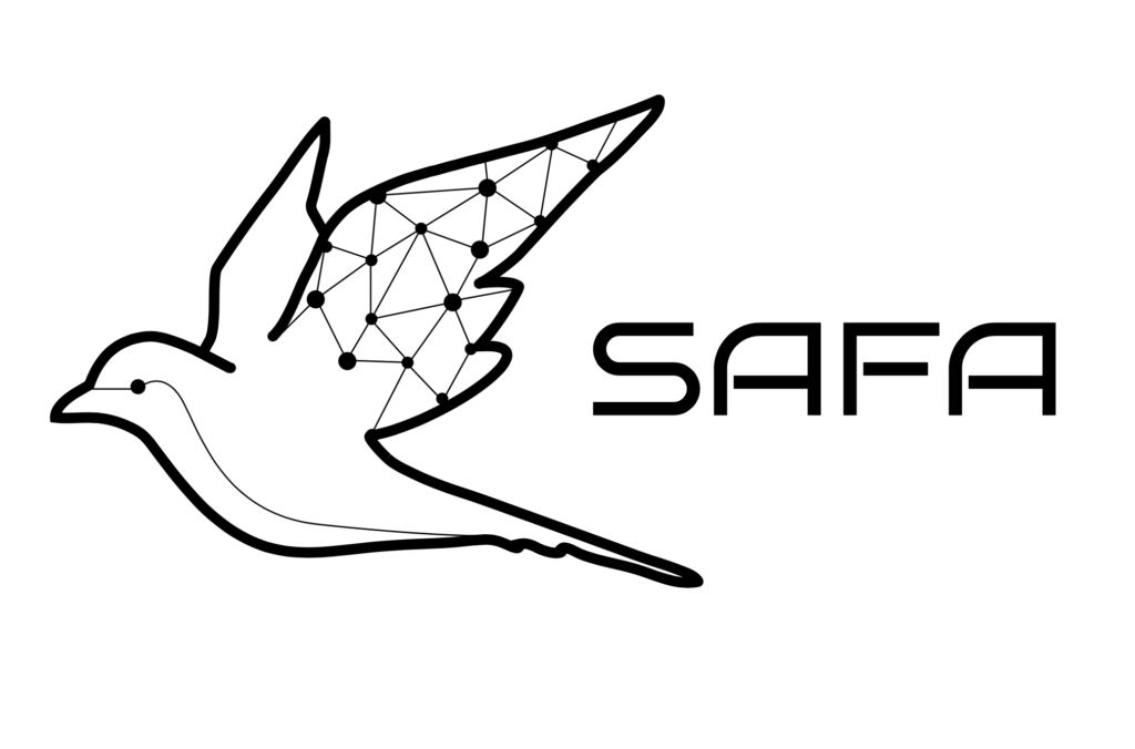
Collaborated with a tech startup to redesign their logo, aiming to modernize their brand identity while retaining elements of familiarity.
The client expressed a desire for a more tech-oriented and contemporary interpretation of their existing bird emblem. Through personalized and iterative communication, we meticulously crafted a design that resonated with their vision and aligned with their future website aesthetics. In addition to refining the logo, our discussions delved into the significance of branding and color psychology, fostering a deeper understanding within the team about the impact of visual elements on brand perception.
This collaborative process not only resulted in a visually striking logo but also facilitated team cohesion and strategic alignment around the brand identity. I am gratified to have contributed to the client’s realization of the importance of branding aesthetics in the tech industry, and to have delivered a logo that symbolized unity and progression, encapsulating their journey as a cohesive team united under a shared vision.
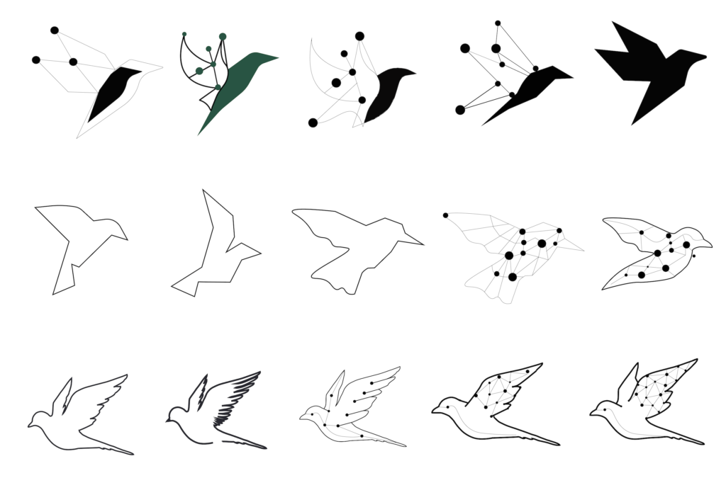
The image below showcases the final result, accompanied by a depiction of select steps and processes leading to its creation, situated on the lower left side.


